 Published By Jessica
 23rd May 2026
 3:08 PM
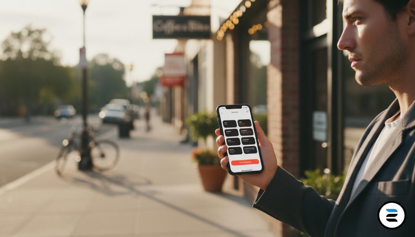
Web Design For Local Businesses That Works On Mobile
So, let’s start with the big question. What actually makes a mobile website work for a local business?
Let’s be honest. Most of your customers are not at a desk when they find you. They are on their phone, often out and about, looking for a quick answer. Your website has a few seconds to help them decide.
If it doesn’t, they leave. No fuss. Just gone.
That is where smart mobile design comes in. And if your current site feels a bit clunky, don’t worry. We have all been there. With the right website design and development approach, you can turn your mobile layout into something that brings in calls and bookings.
Why Mobile Layout Matters For Local Businesses
Here is the thing. Local searches happen on phones. A lot. People search for things like 'plumber near me' or 'best coffee shop in town' while they are out.
They are not browsing for fun. They want action. Call. Book. Visit.
If your site is slow, hard to read, or awkward to tap, it is frustrating. And they will move on to someone who made it easier.
A clean mobile layout does more than look nice. It affects how many enquiries you get and how well you show up in search. If you want a clear view of how that works, this guide on local SEO for small businesses explains it simply.
At C2 Marketing, we focus on sites that work in real life, not just in a preview. That means layouts that guide people to take action without thinking too hard.
Core Principles Of Mobile First Web Design
Let’s make this simple. Mobile first means you design for the smallest screen first, then scale up.
Why? Because it keeps you focused on what matters. No clutter. No noise. Just the essentials.
A good mobile layout should feel effortless. Users should not need to zoom or hunt for buttons. According to mobile design best practices, clear structure and easy navigation keep users engaged.
Key Principles To Keep In Mind
- Simple and clear structure
- Large tap buttons
- Fast loading pages
- Short and readable text
- Clear actions like call or book
- Minimal distractions
- Consistent layout
Between you and me, if your site feels easy to use with one thumb while holding a coffee, you are on the right track.
The Ideal Mobile Homepage Layout For A Local Business
Now let’s get practical. What should your mobile homepage look like?
Think of it like a shop window. People glance, decide, and act. What do they see in the first few seconds?
Above The Fold Essentials
This is the first screen. No scrolling yet. It should answer three things fast. Who are you, what do you do, and what should I do next?
Use a clear headline, a short line of text, and a strong button like 'Call Now' or 'Book Appointment'. And yes, your phone number should be clickable.
Sticky Contact Options
A simple win is a sticky bar with actions like call, directions, or booking. It stays visible as users scroll.
This small change can lift conversions, especially for service businesses. We see it often. Small tweak, big result.
Scrolling Sections That Make Sense
As users scroll, guide them clearly. Show services, then reviews, then a final call to action. No clutter.
If you want to see how layout builds trust, this article on website design and credibility is worth a read.
Mobile Navigation That Actually Helps
Mobile navigation should feel obvious. Not clever. Not fancy. If someone has to think, you lose them.
Keep your menu short. No one wants ten options on a phone. A few key pages like services, about, and contact are enough.
Also, do not rely only on the menu. Add clear buttons across the page so users can act at any time.
Designing Mobile Layouts By Business Type
Not all local businesses need the same layout. Let’s keep it practical.
Restaurants And Cafes
Focus on menu, booking, and location. Keep the menu easy to read. Avoid PDFs. They slow people down.
Trades And Services
Your phone number is key. Make it big, clear, and always visible. Make calling you the easiest option.
Clinics And Salons
Booking matters most. Keep it simple and clear. People want quick reassurance, not a long process.
Different businesses, same goal. Make the next step easy.
Content Design For Small Screens
Even the best layout fails with poor content. Keep sentences short. Break text into clear sections.
Use headings that guide the reader. Keep images light so they load fast and fit well on small screens.
If you are unsure where to start, our copywriting services focus on clear and engaging content that drives action.
Forms Booking And Contact Made Easy
Forms often lose people. They are too long or confusing.
Keep it simple. Name, contact, and one key detail is enough in most cases.
Make all contact options tappable. If users need to copy and paste your number, you have already made it harder than it should be.
Performance SEO And Accessibility
This might sound technical, but it is quite simple. Your site needs to load fast. Use smaller images and keep the design clean.
Speed affects both users and search rankings.
Accessibility matters too. Use clear fonts, good contrast, and buttons that are easy to tap. It helps everyone.
For more insight, explore this UX guide.
Quick Mobile Layout Checklist
Quick check. Open your site on your phone.
Can you tell what the business does straight away? Can you call or book easily? Is the text easy to read?
If not, there is room to improve. Even small fixes can increase enquiries.
Frequently Asked Questions
Do I need a separate mobile website?
No. A responsive design adjusts to all screen sizes and works well.
What should be at the top of my mobile homepage?
Your business name, what you do, and a clear action like call or book.
How can I make my site more mobile friendly?
Use a simple layout, large buttons, fast images, and clear navigation.
Does mobile design affect SEO?
Yes. A fast and user friendly mobile site improves engagement and visibility.
How often should I update my mobile layout?
Review it every 6 to 12 months or when your services change.