
 Published By Cleartwo
 14th November 2026
 3:09 PM
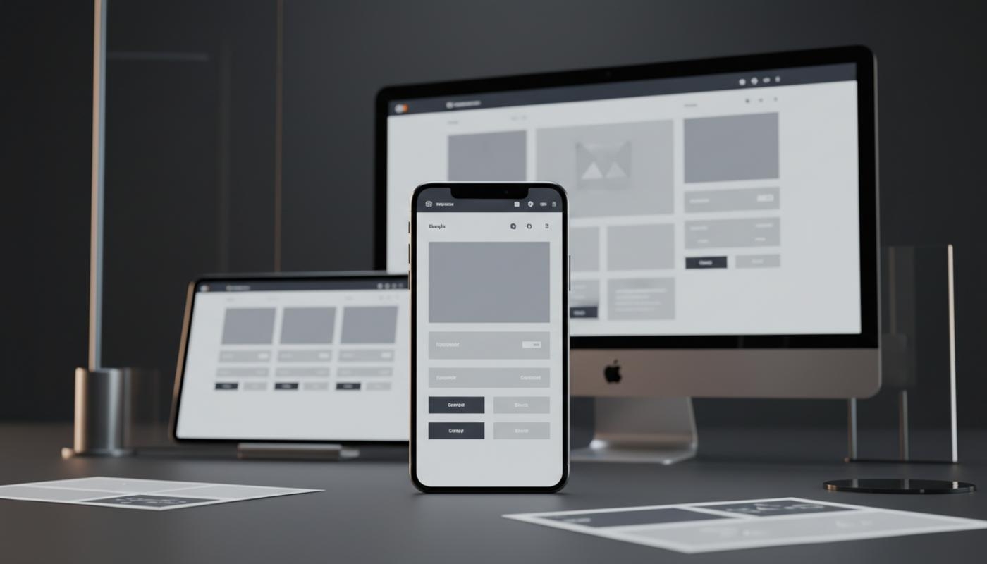
Mobile First Design
Mobile first design is a way of planning and building a website by starting with the smallest practical screen first, usually a mobile phone. Once that core experience works well, the layout is then enhanced for tablets, laptops, and desktop screens.
If you've ever opened a website on your phone and struggled to read the text, tap a button, or complete a form, you'll know why this matters. Mobile first design focuses on the most important content, the clearest user journey, and the simplest version of each page before adding more space, detail, and visual structure for larger screens.
In web architecture, mobile first design is not just about how a website looks on a phone. It affects content hierarchy, navigation, page speed, images, forms, CSS structure, accessibility, and search performance, because it asks what your visitor needs to do and whether they can do it easily on a small screen.
Mobile first does not mean mobile only. A good mobile first website still works brilliantly on desktop, but it avoids the common problem of designing a wide desktop layout first and then trying to squeeze everything into a narrow mobile view afterwards.
At C2 Marketing, we see mobile first thinking as part of building websites that are practical, easy to use, and designed to support real business goals. Strong web design should help people find information, trust your brand, and take action without friction, whatever device they are using.
Why Mobile First Design Matters In Web Architecture
Mobile first design matters because the structure of your website shapes how people experience it. If the architecture is built around desktop space, mobile visitors can end up with hidden content, awkward menus, slow pages, cramped forms, and layouts that feel like an afterthought.
That poor experience can mean lost enquiries, fewer sales, lower engagement, and less trust. Many business owners only spot the issue when enquiries drop, customers complain, or analytics show people leaving key pages too quickly.
Web architecture covers the foundations behind the visible design. It includes how content is ordered, how components behave, how pages load, how navigation works, and how different screen sizes are supported.
When mobile is considered from the start, these decisions are usually cleaner and more focused on your visitors. Smaller screens leave no room for clutter, so you have to decide what really matters, which often leads to stronger messaging, clearer calls to action, simpler layouts, and a better experience across every screen size.
Mobile First Design Compared With Responsive Design
Mobile first design and responsive design are closely related, but they are not the same thing. Responsive web design means a website adapts to different screen sizes and resolutions, while mobile first design describes the order of thinking and development.
A responsive website can be built using a desktop first approach, where the wide layout is designed first and then adjusted for mobile. That can work, but it often creates extra CSS rules, hidden sections, and mobile layouts that feel compressed.
Mobile first responsive design usually starts with a simple single column layout, then adds columns, wider images, expanded navigation, and richer layouts when more space is available. The key difference is priority: responsive design asks whether the website can adapt, while mobile first design asks what is essential first.
Mobile First Is Not Mobile First Indexing
Mobile first design is a design and development method, while mobile first indexing is how Google mainly uses the mobile version of a website's content for indexing and ranking. These two ideas often overlap, but they are not identical.
A mobile first website can support SEO because it tends to improve usability, content access, and technical consistency. However, it does not automatically guarantee rankings, and Google's own guidance explains that mobile content is important for indexing.
In plain English, your mobile pages should include the same essential content, links, images, and structured information as your desktop pages. If important content is only available on desktop, both users and search engines may miss it.
What Mobile First Means For Website Structure
Mobile first web architecture starts with content. Before designing sections, sliders, grids, or animations, you need to know what your visitor is trying to achieve.
On a service page, that might mean understanding the offer and making an enquiry. On an online store, it might mean comparing products, filtering results, and checking out quickly.
Once the main task is clear, the content can be organised in order of importance. The most useful message, proof point, call to action, or product information should not be buried beneath decorative sections, especially because mobile visitors usually move through a page in a more linear way.
A simple service page might place the key offer, benefits, trust signals, and enquiry button near the top. Supporting details, testimonials, and case studies can then follow afterwards, so visitors are not forced to scroll through everything before they understand what you do.
Component architecture also changes under a mobile first approach. This simply means planning reusable page parts, such as navigation, cards, forms, buttons, product grids, filters, testimonials, and calls to action.
A card might appear as a full width item on mobile, two columns on tablet, and three columns on desktop, but its purpose should stay the same. The layout changes, while the usefulness of the component remains clear.
If you're planning a redesign or improving an existing site, thoughtful website design and development can make this process much smoother. The goal is not just to make a design resize, but to create a structure that feels natural across phones, tablets, laptops, and large screens.
How Mobile First CSS Works
Mobile first CSS usually begins with the narrowest layout as the default. That means the base styles are written for small screens first, and wider layouts are then added using media queries.
Media queries are CSS rules that apply only when the screen or browser has enough space. For example, a content grid might start as one column on mobile, become two columns at a medium screen width, and then become three columns on a large screen.
The design grows as space becomes available, rather than being squeezed down from a desktop layout. It is a little like setting up a shop window, where you start with the essentials people need to see first and add supporting displays only when there is room.
Good breakpoint strategy is content led. If a pricing table starts to feel cramped at a certain width, that is a reason to change the layout, while copying a long list of device widths can make CSS harder to maintain and does not reflect the huge variety of screens people use.
Mobile First Design In Practice
A practical mobile first process begins with research. Look at analytics, search queries, customer questions, support issues, and conversion paths before deciding what belongs near the top of a page.
If visitors arrive on a local service website from their phones, they may want quick pricing guidance, trust signals, location details, and a simple enquiry route. If they visit an online store, they may need to browse products quickly, use clear filters, and check out without hassle.
It is also worth checking how easy it is to complete your main enquiry form on a phone. Someone should be able to tap the right button without zooming and find your phone number, opening hours, delivery information, or enquiry route quickly.
The next step is content prioritisation. It helps to divide content into three simple groups:
- Essential content that supports the main task and must be easy to find on mobile.
- Helpful content that builds confidence and supports decision making.
- Optional content that can appear later, be shortened, or be presented differently on larger screens.
Designing the smallest useful layout comes next. This includes the heading order, page sections, navigation, call to action placement, form fields, error messages, and trust signals.
It is also the right time to check whether the page makes sense when read from top to bottom. If the base experience feels clear on a phone, larger layouts can then be enhanced with supporting content, expanded navigation, comparison tables, or richer visual sections.
Key Benefits Of Mobile First Design
One of the biggest benefits of mobile first design is clearer content. Limited space forces better decisions, which can make pages easier to understand and help visitors quickly see what your business offers, why it matters, and what they can do next.
Mobile usability also improves when it is considered early. Menus can be planned for touch interaction, buttons can be large enough to tap, forms can be shorter, and text can be readable without zooming.
Some of the main benefits include:
- Clearer messaging because only the most useful content comes first.
- Smoother mobile journeys for enquiries, purchases, and sign ups.
- More consistent experiences across phones, tablets, and desktops.
- Cleaner code because layouts start simple and build up gradually.
- Better performance when paired with sensible image, font, and script choices.
Mobile first architecture can also make front end code easier to manage. When styles start simple and become more advanced at wider sizes, there are often fewer overrides and fewer conflicts, which can help developers maintain the site more easily over time.
Performance can improve too, especially when mobile first thinking is paired with responsive images, lean JavaScript, careful font loading, and sensible performance budgets. Mobile first design alone does not make a website fast, but it encourages a more disciplined approach to what is loaded and when.
If speed is a concern, it is worth reviewing Core Web Vitals alongside layout and content decisions. Speed, stability, and responsiveness all affect how comfortable a mobile journey feels.
Common Mobile First Mistakes
A common mistake is treating mobile first as mobile only. Desktop users still matter, especially for complex research, business buying journeys, admin tools, and high value purchases.
Mobile first should establish the core experience, then desktop should be improved thoughtfully rather than ignored. Larger screens give you more space, but that space still needs a clear purpose.
Another mistake is hiding important content on mobile. If key headings, copy, product details, internal links, reviews, or structured information appear only on desktop, users and search engines may miss them.
Some teams also choose too many breakpoints. A website does not need a unique layout for every device, but it does need flexible components that change when the content needs a better arrangement.
Performance mistakes are also common. A mobile first layout can still load oversized images, heavy scripts, too many tracking tools, or unnecessary fonts, which is why image optimisation, caching, script control, and testing on slower connections should be part of the process.
How To Audit An Existing Website
An existing desktop first website does not always need to be rebuilt from scratch, but it does need an honest audit. Start by checking the most important pages on a real mobile device, not only by resizing a browser window on a desktop screen.
Look for issues such as:
- Horizontal scrolling that makes the page feel broken.
- Text that feels cramped or hard to read.
- Menus that are awkward to open, close, or understand.
- Important content that disappears on mobile.
- Slow loading pages, especially on mobile data.
- Forms that are hard to complete with a thumb.
Next, compare mobile and desktop content. Important headings, internal links, calls to action, images, product details, reviews, metadata, and structured data should be consistent where they support user needs and SEO.
If mobile is a stripped back version of desktop, that may create problems. The mobile version should be focused and easy to use, but it should not remove information people need to make a decision.
Review the code and components as well. Excessive overrides, fixed width containers, duplicated sections, and layout rules that fight each other are signs that the site may have been forced into responsiveness after the desktop version was built.
Fixing the worst performing templates first is often more practical than trying to change everything at once. Usability testing should include touch interaction, keyboard navigation, zoom, screen reader order, colour contrast, and page speed under realistic conditions.
Mobile First Best Practices
Good mobile first design starts with semantic HTML, logical content order, and clear page structure. This helps browsers, users, assistive technology, and search engines understand the page properly.
Headings should follow a sensible order, links should describe their destination, and buttons should make their purpose clear. These small details make the site easier to use and easier to interpret.
Navigation should be simple but not vague. A mobile menu should help users move quickly, not hide everything behind confusing labels.
For online stores, search, filters, basket access, and checkout should be easy to reach. For lead generation websites, contact options and enquiry forms should be obvious without taking over the whole screen.
Accessibility should be built in from the start. Text needs enough contrast, tap targets should be comfortable, focus indicators should be visible, and the site should work without relying only on hover effects.
Images and media need careful handling too. Use appropriately sized images for small screens, avoid large background images where they add little value, and only load video when it supports the user journey.
At C2 Marketing, we usually look at mobile journeys from both a user and business perspective. It is not enough for a page to look tidy, because visitors also need to understand the message, move through the page, and take the action that matters to your business.
Final Thoughts
Mobile first design in web architecture is about building the essential experience first, then enhancing it as more space becomes available. It is a practical way to create websites that feel clearer, faster, and easier to use across modern devices.
The strongest mobile first websites are not stripped down or basic. They are well prioritised, giving mobile users the content and functionality they need while still offering richer layouts for larger screens.
When mobile first thinking is paired with responsive design, accessibility, performance, and SEO best practice, it creates a stronger foundation for long term website performance. For businesses reviewing an existing site or planning a redesign, the best starting point is to test the core user journey on a phone.
If people cannot understand the offer, navigate easily, read comfortably, and take action without friction, the architecture needs attention. C2 Marketing can help you review your mobile journey and identify the changes that will make the biggest difference.
Frequently Asked Questions
Is Mobile First Design The Same As Responsive Design?
No. Mobile first design describes the order of planning and building, while responsive design describes how a website adapts to different screen sizes.
Does Mobile First Design Improve SEO?
It can support SEO by improving mobile usability, content access, and performance. It is not an automatic ranking guarantee, but it helps create a stronger technical and user experience foundation.
Does Mobile First Mean Removing Desktop Features?
No. It means starting with the essential small screen experience, then adding useful enhancements for larger screens where they make sense.
What Are Mobile First Breakpoints?
Mobile first breakpoints are layout changes added as screen space increases. They are usually used when the content or component needs a better arrangement.
Can An Existing Desktop First Website Become Mobile First?
Yes. It may need content, design, and code changes, and many teams start by improving high traffic pages and key conversion journeys first.