
 Published By Cleartwo
 7th November 2026
 11:34 AM
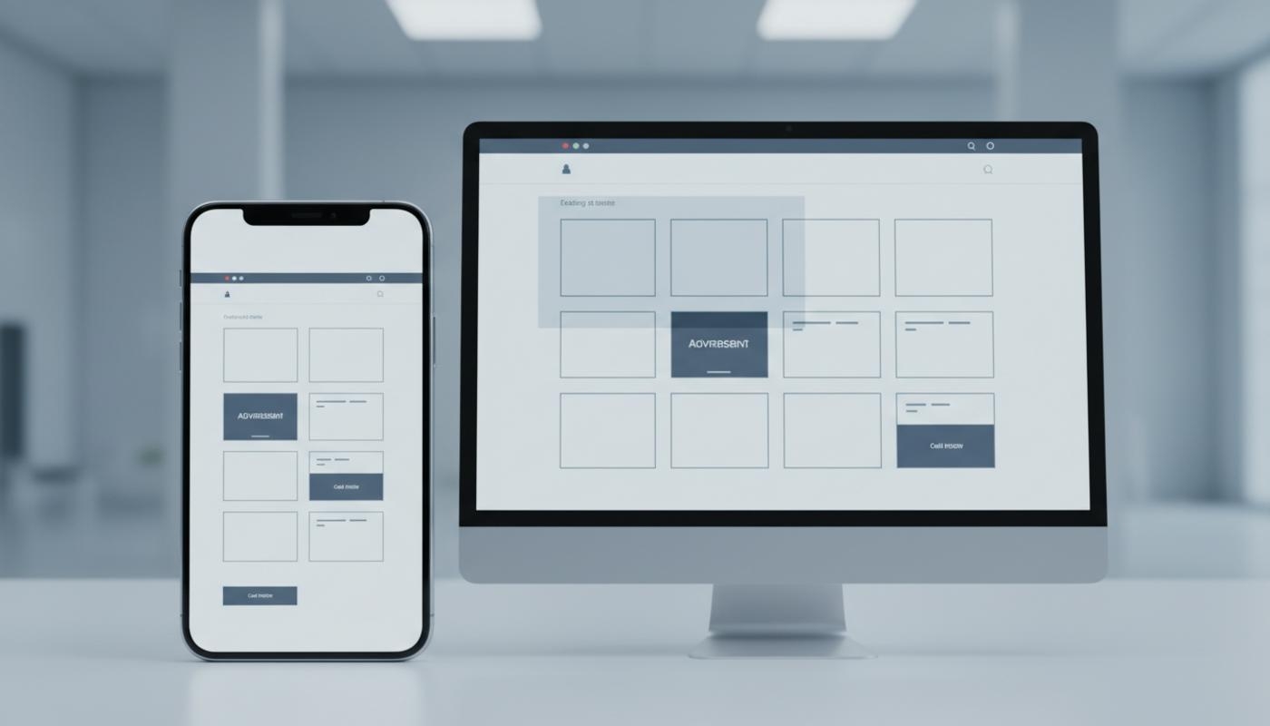
Reduce Cumulative Layout Shift
Have you ever tried to tap a button on a website just as the page jumped and moved it out of reach? It's frustrating, and it can make even a good website feel unreliable. That's exactly what cumulative layout shift is about.
To reduce cumulative layout shift on websites, you need to stop visible page elements from moving unexpectedly while the page loads or while users interact with it. The biggest wins usually come from setting image dimensions, reserving space for adverts and embeds, controlling web fonts, checking mobile layouts, and monitoring both lab and real user data.
Cumulative Layout Shift, often shortened to CLS, is a Core Web Vitals metric that measures visual stability. It is not a general page speed score. A page can load quickly but still feel poor if buttons, images, banners, forms, or product sections jump around while someone is trying to read or click.
A good CLS score is 0.1 or lower for at least 75 per cent of page visits. If your score sits above 0.25, users are likely seeing noticeable movement. That can affect trust, accessibility, conversions, and search performance. C2 Marketing helps businesses improve website performance through practical SEO, web design, web development, and optimisation work that focuses on real user experience, not just technical scores.
What Is Cumulative Layout Shift?
Cumulative Layout Shift measures unexpected movement of visible content on a web page. If a visitor starts reading a paragraph and an image suddenly loads above it, pushing the text down, that movement contributes to CLS. The same applies when an advert, cookie banner, video embed, font change, or late loading product module causes the layout to move.
The key word is unexpected. If a user taps a menu button and the navigation opens, that movement is normally expected because the user caused it. CLS focuses on movement that happens without a clear user action, especially when it interrupts reading, clicking, scrolling, or completing a purchase.
Google defines CLS as part of its Core Web Vitals, alongside Largest Contentful Paint and Interaction to Next Paint. For a neutral technical reference, Google's guidance explains how layout shifts are measured and why visual stability matters for page experience.
Why CLS Matters For Users And Businesses
Poor visual stability is frustrating because it makes a website feel unreliable. A visitor might try to tap an add to basket button, only for a review widget or promotional strip to push the button lower on the screen. On content sites, sudden movement can make people lose their place halfway through an article.
CLS can also create accessibility issues. Sudden shifts can disrupt keyboard users, people using screen magnification, and users with cognitive difficulties who rely on predictable page behaviour. Even small movements can be a problem if they happen close to important controls such as payment buttons, form fields, or consent choices.
From a marketing point of view, reducing CLS supports stronger engagement and conversion rates. Stable pages feel smoother, easier to use, and more trustworthy. It also supports technical SEO, especially when combined with wider Core Web Vitals work and better site structure, as explained in C2 Marketing's article on Core Web Vitals.
How To Measure CLS Properly
The first step is to understand the difference between lab data and field data. Lab tools test a page in a controlled setting, which is useful for finding problems. Field data shows what real visitors experience across different devices, connections, screen sizes, locations, and browsing conditions.
PageSpeed Insights is a useful starting point because it shows both types of data when available. The field section reflects real user experience, while the lab section can help you reproduce common issues. Always check mobile and desktop separately, as CLS problems often appear on mobile first because screens are smaller, advert sizes change, and text wraps more easily.
Google Search Console is helpful for spotting groups of affected pages. Rather than fixing one URL at a time, look for templates that share the same issue, such as product pages, blog posts, category pages, or landing pages. This makes your fixes more efficient because one template improvement can help many URLs at once.
Chrome DevTools is better for detailed diagnosis. Record a performance trace, inspect the layout shift track, and look at the shift groups with the highest impact. Be careful though, because the element that moved is not always the element that caused the shift. Often, the real cause is something inserted or resized just above it.
How To Reduce Cumulative Layout Shift With High Impact Fixes
The best way to reduce cumulative layout shift is to reserve space before content loads. Browsers build the page layout before every asset has finished downloading, so they need clues about how much space images, embeds, adverts, and components will need. When that space is missing, the browser has to rearrange the page later.
Start with images, because they are one of the most common causes of CLS. Every image should have width and height attributes, even when the image is responsive. These values let the browser calculate the correct aspect ratio before the image finishes loading, so the surrounding content does not jump.
Responsive image CSS should preserve the image shape rather than forcing a new height. A common safe pattern is to allow images to scale to the available width while keeping the height automatic. This is especially important for hero banners, product photography, article images, logo grids, and image heavy landing pages.
Videos, maps, social embeds, review widgets, and forms need the same treatment. If an embedded item loads after the rest of the page, place it inside a container with a fixed aspect ratio or a sensible minimum height. This keeps the layout stable while the external content is loading.
Reserve Space For Ads, Banners And Dynamic Content
Adverts and dynamic content are major CLS triggers because they often load after the main page has already appeared. If an advert slot starts with no height and then expands once the advert arrives, everything underneath moves. This is particularly noticeable above the fold, where users are already reading or preparing to click.
Reserve space for ad slots using a clear minimum height and width. If you use multiple advert sizes, reserve enough space for the most common or highest impact size, especially on mobile. Avoid collapsing an empty advert slot after the page has rendered, because removing reserved space can create another layout shift.
Promotional strips, cookie banners, newsletter panels, and app install prompts need careful handling too. Avoid injecting them above existing visible content unless space has already been reserved. If the message must appear after load, an overlay may be less disruptive than pushing the whole page down, as long as it remains accessible and easy to dismiss.
Third party scripts deserve regular checks. Chat widgets, review platforms, social embeds, personalisation tools, recommendation engines, consent platforms, and testing tools can all create shifts after load. Review them after updates, because a script that behaved well last month can still introduce movement after a vendor change.
Fix Font Related Layout Shifts
Fonts can cause layout shift when the browser first displays fallback text and then swaps to the final brand font. If the two fonts have different letter widths, heights, or spacing, headings and paragraphs can move. On mobile, that may turn a two line heading into three lines and push the content beneath it down.
Use a fallback font that closely matches your chosen web font. You can also use font display settings to control how fonts load, although the best choice depends on your design and performance goals. Preloading can help with truly important fonts, but preloading too many font files can slow the page and create new problems.
For more advanced projects, developers can fine tune font sizing so the fallback font takes up almost the same space as the final font. The aim is simple. The first visible text should occupy almost the same space as the final text, so users do not see the page move when the font changes.
Check JavaScript, Lazy Loading And Rendering Behaviour
JavaScript can cause CLS when it adds content after the page has already been painted. Common examples include related products, recommended articles, stock messages, price blocks, filters, delivery information, and personalised content. If these sections start at zero height, the page will move when the real content arrives.
Use placeholders, skeleton screens, or reserved containers for content that loads after the first render. The placeholder should be close to the final component size, not just a tiny spinner. If the real content is much taller than the placeholder, users will still see a layout shift.
Lazy loading can help performance, but it needs to be implemented carefully. Images and modules below the fold should still have reserved dimensions, otherwise they may shift the page as users scroll. This is why field data can show poor CLS even when Lighthouse looks fine, because some shifts happen later in the visit.
Single page applications and heavily scripted websites need extra attention. The first version users see, the loading state, and the final version should all take up similar space. If the page starts small and expands once data arrives, CLS can become a recurring problem across many user journeys.
Reduce CLS On Mobile Devices
Mobile CLS is often worse than desktop CLS because small screens leave less room for error. Text wraps differently, images crop in different ways, advert sizes change, and sticky elements take up a larger share of the viewport. A layout that looks stable on a laptop can still jump noticeably on a phone.
Test important templates at narrow viewport widths, not just standard desktop sizes. Check top navigation, hero banners, cookie notices, product cards, forms, image galleries, accordions, and sticky calls to action. Pay close attention to elements near the top of the page because shifts there affect a large part of the viewport.
Mobile advert reservations should match mobile placements, not desktop assumptions. A wide desktop banner may become a square, a smaller rectangle, or a different unit entirely. If your reserved space does not match the mobile advert behaviour, users can still experience content jumping.
A Practical CLS Debugging Workflow
Start by checking PageSpeed Insights and Search Console to find whether the issue affects one page, one template, or a large section of the site. Compare mobile and desktop results, then decide whether you are dealing with an initial load issue or a later issue. High lab CLS and high field CLS usually point to visible content moving during initial rendering.
If lab CLS is low but field CLS is high, look at what happens after the page has loaded. Scroll the page, accept or reject cookies, wait for adverts, interact with filters, open accordions, and test on slower mobile connections. Later CLS often comes from scripts, embeds, lazy loaded content, or dynamic personalisation.
Use Chrome DevTools to record the page and inspect the largest shift group. Find what changed immediately before the movement, rather than only looking at the element that moved. Apply the smallest safe fix first, then rerun the test and monitor field data after deployment.
For businesses planning wider improvements, it often helps to combine performance, design, and development work rather than treating CLS as a one off bug. C2 Marketing's website design and development support can help align technical fixes with usability, conversion, branding, and search goals.
Prioritised Checklist To Improve CLS Score
Not every fix has the same impact, so prioritisation matters. Quick wins are usually the safest place to start because they reduce common problems without changing the whole design.
- Add width and height values to images.
- Define aspect ratios for banners, videos, maps, and embeds.
- Reserve space for adverts, widgets, and dynamic content.
- Stop banners and pop ups from pushing visible content down.
- Choose fallback fonts that closely match your final web fonts.
- Test mobile layouts before and after changes go live.
- Review third party scripts after updates or campaign launches.
Medium effort improvements include standardising component dimensions, improving placeholders, reviewing lazy loaded modules, correcting responsive image ratios, and replacing animations that change the layout. Avoid animating properties such as height, top, left, margin, or padding when they affect page layout. Use transform and opacity where possible because they are less likely to move surrounding content.
Advanced improvements involve deeper monitoring and governance. Add reporting that shows which elements are shifting, review third party script loading, create performance budgets, and test releases before deployment. If you run a CMS, ecommerce platform, or campaign heavy site, build checks into your publishing process so new banners, plugins, apps, and embeds do not reintroduce the same problems.
CMS And Platform Considerations
WordPress sites often develop CLS issues through themes, plugins, image blocks, related post widgets, advert placements, and pop ups. Check whether your theme outputs image dimensions correctly and whether lazy loaded images still reserve space. Consent tools and promotional plugins should be tested in both accepted and rejected states.
Shopify stores should review product media, review apps, recommendation blocks, collection filters, variant selectors, and promotional bars. Product pages can be especially sensitive because small shifts near price, stock, delivery, or checkout buttons can affect buying confidence. Collection pages should also be checked after filters or sorting options update the layout.
Visual builders such as Webflow need checks at each screen size. Set image sizes, define media ratios, and inspect custom embeds across mobile, tablet, and desktop views. For custom websites, create component size rules and simple tests so developers know how much space each reusable section should occupy before content arrives.
Common CLS Mistakes To Avoid
A common mistake is relying only on Lighthouse. Lighthouse is useful, but it may miss shifts that happen after scrolling, after cookie choices, or after third party scripts load. Always compare lab testing with real user data to avoid fixing the wrong problem.
Another mistake is fixing the moved element instead of the true cause. If a paragraph jumps down, the cause may be an advert, image, banner, or script above it. Look for the element inserted, resized, or restyled immediately before the movement.
Teams also forget to test pages beyond the homepage. Blog posts, product pages, category pages, landing pages, forms, and checkout flows can all have different CLS behaviour. For broader performance improvements that connect search, usability, and conversion, C2 Marketing takes a practical approach to helping businesses build stronger websites that perform in the real world.
Final Thoughts
Reducing cumulative layout shift is really about making your website feel steady, predictable, and easy to use. The most effective fixes are often straightforward. Reserve space, define dimensions, control fonts, test mobile layouts, and watch what third party scripts are doing after the page loads.
Good CLS optimisation should protect the user journey rather than strip away useful features. You can still use adverts, animations, dynamic content, banners, and rich media, but they need to be planned properly. When visual stability becomes part of your design, development, SEO, and content process, your website becomes easier to trust and easier to convert on.
If your pages are shifting and you're not sure where to start, C2 Marketing can review your website performance and help prioritise the fixes that will make the biggest difference for your users.
Frequently Asked Questions
What Is A Good CLS Score?
A good CLS score is 0.1 or lower for at least 75 per cent of page visits. Scores above 0.25 are usually considered poor and should be prioritised.
Why Is My CLS Different In Lighthouse And PageSpeed Insights?
Lighthouse uses lab testing in a controlled environment, while PageSpeed Insights can show field data from real users. Field data may include scrolling, adverts, cookies, and later page behaviour that lab tests miss.
Can Images Cause Cumulative Layout Shift?
Yes, images without width and height values can cause content to jump when they load. Adding dimensions and preserving the correct aspect ratio helps the browser reserve space early.
Can Lazy Loading Increase CLS?
Lazy loading can increase CLS if the page does not reserve space before the content appears. Use fixed dimensions, aspect ratios, or placeholders for lazy loaded images and modules.
How Often Should CLS Be Monitored?
CLS should be checked after major design changes, CMS updates, plugin changes, advert changes, and new campaign launches. Regular monitoring helps catch layout shifts before they affect too many users.