
 Published By Jessica
 15th November 2026
 11:28 AM
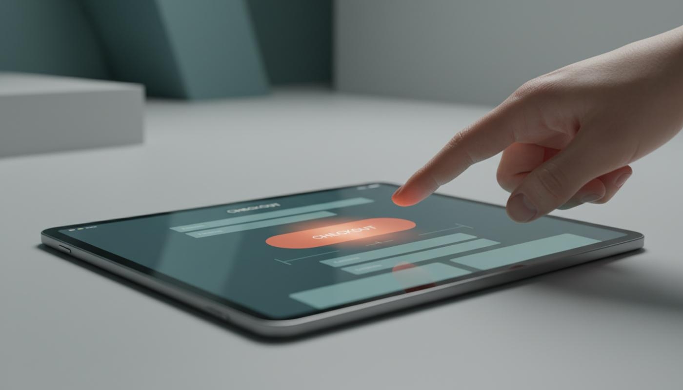
Clear Call To Action Buttons
Clear call to action buttons help visitors understand exactly what to do next, whether that means buying a product, booking a call, downloading a resource or sending an enquiry. If people visit your website but do not take action, your buttons may be part of the problem because users can hesitate, miss the next step, abandon forms or leave when the action does not feel clear enough.
A strong CTA button combines simple wording, visible design, accessible interaction and a clear promise about what happens after the click. It is not just about making something bright or bold. It is about reducing hesitation, guiding attention and making the next step feel obvious.
When users can quickly see the action, understand the benefit and trust the outcome, they are far more likely to continue. If your website gets visitors but not enough enquiries, sales or sign ups, C2 Marketing can help turn clearer journeys into more meaningful results through practical design, copywriting, SEO and conversion focused strategy.
What Is A Call To Action Button?
A call to action button is a clickable element that encourages a user to take a specific action. Common examples include Buy now, Request a quote, Book a consultation, Download the checklist and Start free trial. The button should make the next step feel clear, useful and relevant to the page.
A button is best used when the user is completing an action, such as submitting a form, confirming a choice, adding an item to a basket or opening an interactive process. A link is usually better when the user is simply moving to another page or reading more information. This distinction matters because it helps users, browsers and assistive technology understand what the element is meant to do.
Start With One Clear CTA Goal
Before choosing colours or writing button copy, decide what you want the user to do and why that action matters. What is the one action you would most like someone to take on this page? A landing page might aim to generate quote requests, while an ecommerce product page might focus on adding an item to the basket. A blog page may encourage newsletter sign ups or guide readers to related content.
Most pages work best when they have one primary CTA supported by quieter secondary options. If every button looks equally important, users have to work harder to decide what to do. That extra thinking can reduce confidence, especially on mobile where screen space is limited.
The CTA should also match the user's stage in the journey. Someone reading an introductory article may not be ready to buy, but they may be happy to download a checklist or read a related resource. Someone on a pricing page is usually closer to taking action, so a stronger CTA such as Request a quote may feel more appropriate.
Write CTA Button Copy That Makes Sense Instantly
Good CTA button copy is short, specific and action led. It should tell people what they are doing, not force them to guess. Would a first time visitor know what happens after they click? Vague labels such as Submit, Click here and Continue often create uncertainty because they do not explain the result of the action.
Use strong verbs that describe the step clearly. Words such as Download, Book, Start, Compare, Buy, Save, Create and Request are easy to scan. When possible, pair the action with the outcome, such as Download the checklist, Book my consultation or Send my enquiry.
Here are a few simple improvements that show how clearer wording changes the user experience:
- Submit becomes Send my enquiry
- Click here becomes View pricing
- Learn more becomes See how it works
- Sign up becomes Start my free account
- Download becomes Download the website checklist
Button text should usually be concise, but not so short that it becomes unclear. Two to five words often works well, although the right length depends on the action. If the surrounding page already explains the offer, the button can be shorter. If the button appears in a busy section, a little more detail can help.
For more support with persuasive wording, the C2 Marketing article on how to write a call to action explores the copywriting side in more detail. Strong design gets attention, but strong wording gives people a reason to act.
Create Strong Visual Hierarchy
Visual hierarchy means showing users which elements matter most. Your primary CTA should usually have the strongest visual treatment on the page. Is your main button easy to spot within a few seconds? A filled button with clear contrast often works well for the main action, while secondary actions can use lighter styling, outlines or simple text links.
Avoid making several buttons compete in the same area. If Book a call, Download brochure and Contact us all look identical, the page gives no clear direction. Choose the action that best supports the page goal, then make the other options less dominant.
Whitespace is just as important as colour. A button needs enough space around it so it does not feel buried in text, images or other controls. Good spacing helps people recognise the button quickly and tap it accurately on smaller screens.
Choose Button Colours With Contrast In Mind
There is no universal best CTA button colour. Red, green, blue and orange can all work when they suit the brand, stand out from the page and meet contrast requirements. The better question is whether the button is easy to notice, easy to read and clearly different from less important elements.
Colour should never be the only way to communicate meaning. People with colour vision differences may not see the distinction you intended. Use text, shape, position, size and interaction states alongside colour so the CTA remains understandable for everyone.
Accessibility guidance such as WCAG is useful when checking contrast, focus and target size. As a simple rule, test the button text against the button background and the button itself against the surrounding page. A beautiful button that people struggle to read is not doing its job.
Design CTA Buttons For Mobile Users
Mobile CTA button design deserves close attention because users are tapping with fingers rather than clicking with a mouse. Buttons need enough height, width and surrounding space to avoid accidental taps. A common practical benchmark is a touch area of around 48 x 48 pixels, although your layout and accessibility needs may require more room.
On mobile, full width buttons can work well when there is one clear action. They are easy to spot, easy to tap and less likely to feel cramped. However, full width styling should still feel balanced and should not push essential context too far down the page.
Check how the button behaves on smaller screens. Long labels should not wrap awkwardly or create strange button shapes. Sticky or floating CTAs can be useful, but they should not cover content, cookie notices, chat widgets or form fields.
Make CTA Buttons Accessible
Accessible CTA buttons work for people using keyboards, screen readers, touch devices and different visual settings. A button should be reachable with the keyboard and have a visible focus state, so users can see where they are on the page. Removing focus outlines for aesthetic reasons can make a website much harder to use.
The accessible name of the button should describe the action clearly. Icon only buttons need a proper text label for assistive technology, even if that text is not visually displayed. Avoid using Click here as the only label because it gives little meaning when read out of context.
Design every important state, not just the default button. Users should be able to recognise hover, focus, active, disabled, loading, success and error states. This is especially important on forms and checkout pages, where people need reassurance that their click has worked.
Place The CTA Where Users Are Ready To Act
Above the fold placement can be powerful when users already understand the offer. For example, a returning visitor on a product page may be ready to add an item to the basket immediately. In that case, hiding the CTA far down the page can create unnecessary friction.
For more complex offers, users may need context before they act. A consultancy service, high value product or detailed software solution often needs benefits, proof, pricing signals or frequently asked questions before the CTA feels natural. Placing another CTA after that supporting information can capture users at the moment they feel ready.
Match the CTA to the nearby content. A section about pricing should lead naturally to View pricing or Request a quote, while a section about features may suit See how it works. Unrelated CTAs can interrupt the reading journey and make the page feel pushy.
Add Helpful CTA Microcopy
Microcopy is the small supporting text placed near a button. It can reduce hesitation by answering a simple concern at the exact moment of decision. Good examples include No credit card required, Takes less than two minutes, Download instantly or We reply within one working day.
Only use reassurance copy when it is accurate. False urgency, fake scarcity or vague promises can damage trust. The best microcopy is honest, specific and close enough to the button for users to connect it with the action.
Test CTA Button Design Before And After Publishing
Testing helps you move beyond personal opinion. Before publishing, ask whether the primary action is obvious, the wording makes sense without extra explanation and the button works on desktop, mobile and keyboard navigation. Also check that the destination matches the label, because a mismatch can create frustration.
After publishing, measure more than button clicks. A button may receive plenty of clicks but still fail if users abandon the form, basket or next page. That can feel frustrating, especially when you know people are interested but they are not quite getting over the line. Track the full conversion journey, including form starts, form completions, checkout completion, downloads, qualified leads and revenue where relevant.
A/B testing can help compare one version against another, but it works best when you test a clear hypothesis. For example, you might test whether Download the free checklist generates more completed downloads than Download now. If you want a structured approach, C2 Marketing's article on how to run an A/B test explains how to avoid reading too much into random changes.
Common CTA Button Mistakes To Avoid
Many CTA problems come from unclear decisions rather than poor creativity. A button can look attractive but still fail because the wording is vague, the placement is wrong or too many actions compete for attention. The goal is not to decorate the page, but to make the next step feel obvious and worthwhile.
- Using vague labels such as Submit or Click here
- Giving several actions equal visual importance
- Choosing low contrast colours that are difficult to read
- Making buttons too small for mobile users
- Removing visible keyboard focus states
- Using buttons and links interchangeably
- Relying on urgency that does not feel genuine
- Measuring clicks instead of completed outcomes
If your website has these issues across key pages, a design and conversion review can uncover quick wins. C2 Marketing's website design and development support focuses on building clearer, faster and more effective user journeys.
CTA Button Design Checklist
A simple checklist can help you review existing buttons or create new ones with more confidence. Use it when designing landing pages, ecommerce pages, service pages, forms and campaign pages. It keeps the focus on clarity, usability and performance rather than guesswork.
- Define one primary action for the page
- Use specific, outcome focused button copy
- Make the primary CTA visually stronger than secondary actions
- Ensure colour contrast is strong enough to read comfortably
- Use enough spacing around the button
- Make the button easy to tap on mobile
- Keep the destination consistent with the label
- Provide visible hover, focus, loading and error states
- Add honest microcopy where it reduces hesitation
- Track completed conversions, not only button clicks
Final Thoughts
Clear call to action buttons online are built from a mix of good copy, strong visual hierarchy, accessible design and careful testing. The most effective buttons do not force users to think too hard. They explain the action, show the benefit and make the next step feel safe.
Start with the user's goal, then design the button around that decision. If the wording is specific, the contrast is strong, the placement feels natural and the interaction works smoothly, your CTA has a much better chance of turning interest into action. If you want a simple next step today, review the most important button on your website and ask yourself whether a new visitor would know exactly what to do and why it matters.
Frequently Asked Questions
What Makes A CTA Button Clear?
A clear CTA button tells users what action to take and what will happen next. It should be easy to see, easy to read and relevant to the surrounding content.
How Long Should CTA Button Text Be?
CTA button text is usually best when it is short but specific. Two to five words often works well, as long as the action and outcome are clear.
What Colour Should A CTA Button Be?
The best colour is one that stands out from the page, fits your brand and provides strong contrast. There is no single colour that works best for every website.
Should Every Page Have Only One CTA?
Most pages should have one primary CTA, but they can also include secondary actions where useful. The key is to make the main action visually and strategically clear.
How Do I Know If My CTA Button Is Working?
Track both clicks and completed outcomes, such as enquiries, sales, downloads or bookings. If people click but do not convert, the issue may be with the next step rather than the button itself.