
 Published By Jessica
 15th September 2026
 3:23 PM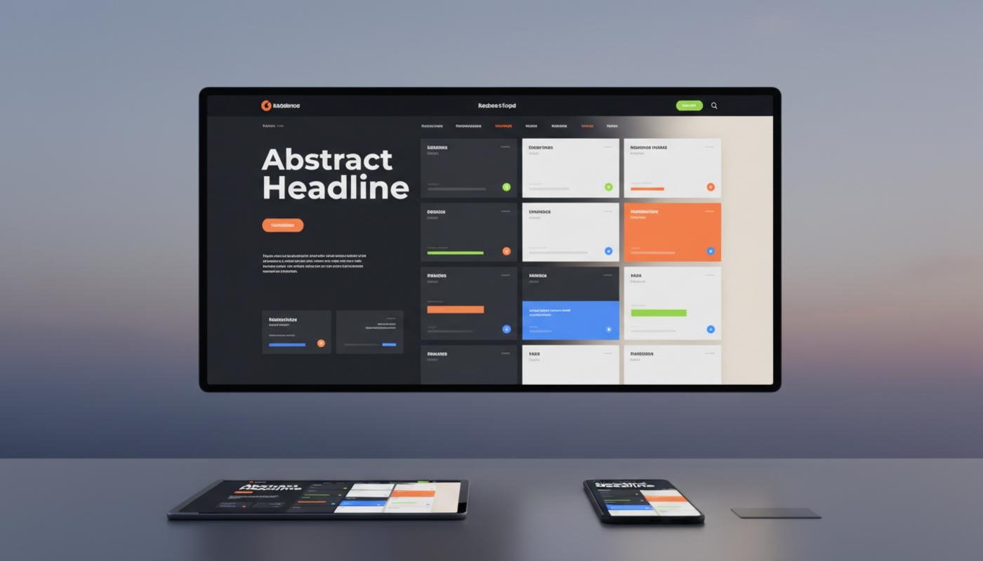
Website Design Trends
Website design trends for modern websites in 2026 are moving towards faster, more accessible, more personal and more visually expressive digital experiences. A website now needs to do more than look attractive because it should guide visitors clearly, load quickly, work beautifully on mobile and support search visibility. Most importantly, it should help people feel confident enough to take action, whether that means making an enquiry, booking a call or buying online.
If your website feels a little tired, you are not alone. It can be difficult to know which design ideas are worth your time, especially when new trends appear every year. The good news is that your website does not need every modern feature to perform well. It needs the right features for your audience, your goals and the way your customers make decisions.
The biggest shift is that design is becoming more strategic. Trends such as Bento grid layouts, kinetic typography, liquid glass effects, micro interactions, dark mode, inclusive design and AI powered personalisation are not just style choices. When used properly, they can improve user experience, brand trust, lead quality and conversion rates. That makes modern website design a practical business decision, not just a creative one.
C2 Marketing helps businesses turn these design ideas into practical websites that support real growth. The team combines creative thinking, web development, SEO, copywriting and data led insight, so every design decision has a clear purpose. That matters because a current website should not simply follow trends for the sake of it. It should help your business stand out, communicate clearly and perform better online.
Why 2026 Is A Turning Point For Modern Website Design
Modern website design in 2026 is shaped by three major priorities: experience, performance and trust. Visitors expect websites to feel polished and interactive, but they also expect pages to load quickly and information to be easy to find. If a website makes people work too hard, they are likely to leave before they understand the value of the business. A strong design helps visitors feel confident from the first few seconds.
The best websites now balance creativity with clarity. Instead of relying on flat, static pages, brands are using depth, motion, modular layouts and richer storytelling to keep users engaged. At the same time, the strongest designs still feel simple because every section has a role, every call to action is easy to spot and every page supports the user journey. Good design should make decisions easier, not add more noise.
AI powered tools are also changing how websites respond to visitors. Personalised content, smart search, chat interfaces and adaptive product recommendations are becoming more common across many sectors. These features only work well when they are built around consent, privacy, speed and genuinely useful experiences. A modern website should feel helpful and relevant without feeling intrusive.
Website Design Trends For Modern Websites In 2026
The most important website design trends for modern websites in 2026 are not about copying whatever looks popular. They are about choosing the right design patterns for your audience, brand and business goals. The real question is not just what looks good, but what helps your visitors understand, trust and take action. That is where strong design starts to support measurable business results.
A local service business, an ecommerce store and a B2B company may all use similar ideas, but they should apply them in very different ways. A local trades business might need reviews, service areas, trust signals and quick contact buttons. An online shop might benefit from stronger product visuals, personal recommendations and a simpler checkout journey. A professional services firm may need case studies, team profiles and clear enquiry forms to build confidence.
Bento Grid Layouts And Modular Content Blocks
Bento grid layouts are one of the most practical design trends for 2026 because they make information easier to scan. They use neat content blocks to present services, features, benefits, testimonials and calls to action in a structured but visually interesting way. This style works especially well on home pages, landing pages, SaaS pages and ecommerce category sections. It gives each message a clear space without making the page feel plain.
The business value is clear because users can understand the page faster. Instead of forcing visitors through long walls of text, a Bento layout helps separate key points into useful sections. This supports better comprehension, stronger visual hierarchy and smoother movement towards enquiries, purchases or bookings. When the layout is planned around the customer journey, it can make a complex offer feel much easier to understand.
Organic Layouts, Broken Grids And Spatial Depth
Organic layouts and broken grids are becoming popular because they make websites feel less rigid. Rather than placing every element in perfectly predictable rows, designers are using overlapping sections, layered visuals, rounded panels and asymmetrical spacing. This can create a more editorial, premium or creative feel when it is handled carefully. It is especially useful for brands that want to feel distinctive without losing clarity.
The key is to avoid sacrificing usability for style. A broken grid should still guide the eye naturally from the main message to the supporting content and then towards the next action. If users have to work too hard to understand the page, the design has gone too far. The best examples feel creative, but they still make the next step obvious.
Liquid Glass And Softer Interface Styles
Liquid glass and modern glass effects use soft transparency, blur, depth and light effects to make interfaces feel more refined. These effects can work well for cards, overlays, navigation panels and product feature sections. They are especially useful when a brand wants a modern, polished or technology led appearance. Used lightly, they can make a page feel more premium without overwhelming the content.
However, contrast and readability must come first. Text placed over glass effects can become difficult to read if backgrounds are too busy or colours are too pale. A good design should test these elements across devices, screen brightness levels and accessibility settings before using them widely. The effect should support the message rather than compete with it.
Dark Mode, Monochrome Palettes And Dopamine Colours
Dark mode is no longer just a novelty. Many users prefer it because it can feel comfortable, stylish and easier on the eyes in low light settings. For brands, it also creates opportunities for stronger contrast, premium visuals and more dramatic product presentation. It can work particularly well for creative, technology, luxury and media focused websites.
At the same time, monochrome palettes and bright dopamine colours are both gaining attention. Monochrome designs can look clean, confident and editorial, while vivid colour palettes can create energy and emotional impact. The best approach is to use colour with discipline, so your website feels memorable without overwhelming the visitor. Colour should support brand recognition, readability and conversion, not just decoration.
Typography And Motion That Make Websites Feel Alive
Typography is becoming a major part of website personality in 2026. Oversized headings, variable fonts, expressive typefaces and kinetic typography can make a page feel distinctive before a user even reads the details. This is useful for brands that want to create instant recognition and a stronger emotional connection. Good typography can also make content easier to scan when the hierarchy is planned properly.
Kinetic typography simply means text that moves in a purposeful way, such as a heading that shifts gently as someone scrolls. It can help highlight key messages, reveal statistics or add drama to a hero section. The safest approach is to use motion sparingly, keep text readable and avoid animations that distract from the main message. Movement should guide attention rather than pull users away from what matters.
Micro interactions are another important trend because they give users feedback. A button changing state, a form field confirming an entry or a menu opening smoothly can make a website feel more intuitive. These small details are easy to overlook, but they often make the difference between a site that feels basic and one that feels carefully built. They are also useful for reducing uncertainty during forms, checkouts and navigation.
User First UX And Accessibility Trends
User first design is one of the strongest design practices for 2026. The goal is to reduce friction and make each page feel effortless to use. This means clear navigation, readable content, obvious calls to action, simple forms, fast loading pages and layouts that work smoothly on mobile screens. If your mobile experience is awkward, it could be costing you valuable enquiries.
Accessibility first design is also essential. A modern website should support keyboard navigation, readable font sizes, meaningful alt text, visible focus states, strong colour contrast and reduced motion settings for people who prefer fewer animations. The WCAG standards are a helpful reference for understanding how to make digital content more inclusive. Following these principles makes your website more usable for a wider range of people.
Good accessibility is not only about compliance. It improves the experience for everyone, including users on small screens, older visitors, people with temporary injuries and users browsing in difficult lighting or noisy environments. Inclusive digital experiences usually lead to clearer design, better engagement and stronger trust. They also show that your business takes the needs of its audience seriously.
AI Personalisation And Smarter Website Journeys
AI powered personalisation is becoming more common across online experiences, but it needs to be used carefully. The most useful examples include smarter product recommendations, personalised landing page content, helpful chat support and dynamic calls to action based on user intent. These features can make websites feel more relevant without forcing visitors through a complicated journey. The best use cases remove effort and make decisions easier.
Privacy first personalisation is the standard businesses should aim for. Users should understand what data is being used, why it improves their experience and how they can manage their preferences. Clear consent messages and honest language build more trust than vague banners or hidden settings. If personalisation feels transparent and useful, visitors are more likely to respond positively.
Websites also need to be easier for search engines and digital assistants to understand. Clear headings, simple page structure, descriptive page titles, useful FAQs and well organised content all help your pages make sense to both people and machines. This is where design, development, copywriting and SEO need to work together from the start. A well structured page gives users better answers and gives search platforms clearer context.
Performance First And Sustainable Web Design
A beautiful website still needs to be fast. Performance first design focuses on lightweight pages, optimised images, efficient code, sensible fonts and hosting that can cope with traffic. Slow websites frustrate visitors, weaken conversion rates and can make paid and organic marketing less effective. Speed is not just a technical issue because it directly affects how people experience your brand.
Mobile first design is especially important for UK businesses because many users will first find your website on a phone. Layouts should be designed around touch friendly buttons, simple menus, readable content and quick access to key actions. A mobile page should never feel like a squeezed down version of a desktop design. It should be planned around how people actually browse, compare and contact businesses on smaller screens.
Sustainable web design is also becoming part of the conversation. Leaner websites use fewer unnecessary scripts, smaller image files and cleaner development practices. For businesses, this often means faster performance, lower maintenance and a better user experience. That makes sustainability both responsible and commercially sensible.
If speed is a concern, practical improvements often begin with hosting, image compression, caching and cleaner page structure. Helpful advice on this topic can be found in C2 Marketing's article on faster website performance. These foundations are worth fixing before adding heavy effects, large videos or complex animations. A fast foundation gives modern design features a much better chance of working well.
Content And Storytelling Trends For Modern Websites
Modern websites in 2026 are placing more emphasis on clear storytelling. A strong hero section should explain who you help, what you do and why it matters within a few seconds. This does not mean cramming every detail above the fold, but it does mean giving visitors enough context to feel they are in the right place. Clear messaging helps people decide whether to keep reading.
Microcopy is also becoming more important. Button labels, form instructions, error messages, navigation labels and short supporting text all influence how easy a website feels to use. Friendly, specific wording can reduce hesitation and make users feel more confident about taking the next step. Small wording changes can often improve form completions, calls and enquiries.
Visual personality is returning through freehand illustrations, scrapbook inspired details, textures and human touches. These elements can help brands avoid looking too generic, especially when many websites use similar templates. The trick is to add personality without making pages messy or distracting from the offer. Design should feel distinctive while still making the content easy to understand.
How To Choose The Right Trends For Your Website
The best way to choose design trends is to start with your goals. If your website needs more leads, prioritise clearer calls to action, stronger trust signals, better mobile usability and sharper landing pages. If your issue is brand perception, focus on visual identity, typography, content structure and interactive details that make the site feel more credible. Your design choices should solve a real problem rather than simply follow what is fashionable.
Not every trend deserves a place on your site. The most useful question is which trends will actually support your business goals and make the experience better for your audience. Foundations include speed, accessibility, mobile first layouts, clear navigation and strong content. High value enhancements include Bento grids, micro interactions, dark mode, improved visual hierarchy and better form design, while experimental extras include immersive 3D, complex scroll storytelling and bold spatial effects.
At C2 Marketing, we usually recommend starting with the essentials first. Speed, clarity, mobile usability and trust signals often make a bigger difference than adding visual effects too early. Working with the right team can help you avoid expensive guesswork and focus on changes that improve performance. Once the foundations are strong, creative enhancements can be added with much more confidence.
C2 Marketing offers website design and development support that connects creative design with practical performance goals. That means your site can look current while still being easy to manage, simple to use and built around measurable outcomes. The right approach should help your website attract visitors, explain your value and turn interest into action. Good design should feel creative, but it should also be commercially useful.
User experience should sit at the centre of every trend decision. If you want to understand why UX has such a strong impact on design success, C2 Marketing has a useful article on user experience and website performance. It explains why attractive design alone is not enough if visitors struggle to move through your site. A better journey often leads to better results.
Practical Checklist For A 2026 Ready Website
A strong 2026 website should be designed with both users and business outcomes in mind. Before investing in advanced visual effects, check whether the basics are already working well. Many websites can improve results significantly by fixing clarity, speed, accessibility and content before adding more complex design features. These foundations support better rankings, better engagement and better conversion rates.
Start by reviewing your mobile experience and making sure key actions are easy to complete. Check page speed, image sizes, hosting quality and unnecessary scripts, as these are common causes of weak performance. Improve headings, page structure, calls to action and trust signals so visitors can understand your offer quickly. Test colour contrast, keyboard navigation, form labels and readable font sizes before using modern design enhancements more widely.
It is also worth treating your website as an ongoing asset rather than a one time project. Design trends will keep changing, but the strongest websites improve through testing, content updates, performance checks and customer feedback. Small, consistent improvements often deliver better results than waiting years for a full rebuild. A website that evolves with your audience is more likely to stay useful, visible and competitive.
Final Thoughts
Website design trends in 2026 are exciting, but the best websites will not be the ones that use every trend at once. They will be the websites that feel clear, fast, accessible, trustworthy and genuinely useful. Visual style matters, but it should always support the message, the user journey and the business goal. A modern website should make it easy for visitors to understand what you do and why they should choose you.
Bento grids, kinetic typography, dark mode, liquid glass, AI personalisation, micro interactions and sustainable design can all add value when they are used with care. The right choices depend on your audience, your brand, your budget and what your website needs to achieve. A current website should look polished, but more importantly, it should help people understand you, trust you and take action. That is the difference between a trendy website and a high performing one.
If you are planning a new website or wondering whether your current site is still working hard enough, C2 Marketing can help you choose the right design approach for your goals. The most effective websites combine strong creative direction with speed, usability, content and search performance. With the right plan, your website can feel modern without becoming complicated. It can also become a stronger part of your wider marketing strategy.
Frequently Asked Questions
What Are The Biggest Website Design Trends For 2026?
The biggest trends include Bento grid layouts, kinetic typography, liquid glass effects, dark mode, micro interactions, accessibility first design, AI personalisation and performance first development. You do not need all of them, but the right mix can make your site feel clearer, faster and more engaging.
Should Every Business Follow Website Design Trends?
No, every business does not need to follow every trend. The best choice is the one that helps your visitors understand, trust and contact you more easily.
Why Is Accessibility Important In Modern Website Design?
Accessibility helps more people use your website comfortably and confidently. It also supports better usability, stronger trust and a more professional online experience for every visitor.
Can Motion And Animation Hurt Website Performance?
Yes, heavy animation can slow pages and distract users if it is not handled carefully. Motion should be lightweight, purposeful and respectful of people who prefer reduced movement.
How Often Should A Website Be Redesigned?
Most businesses should review their website every year and consider a larger redesign every three to five years. Regular improvements are often better than waiting until the site feels completely outdated.