
 Published By Jessica
 2nd September 2026
 2:39 PM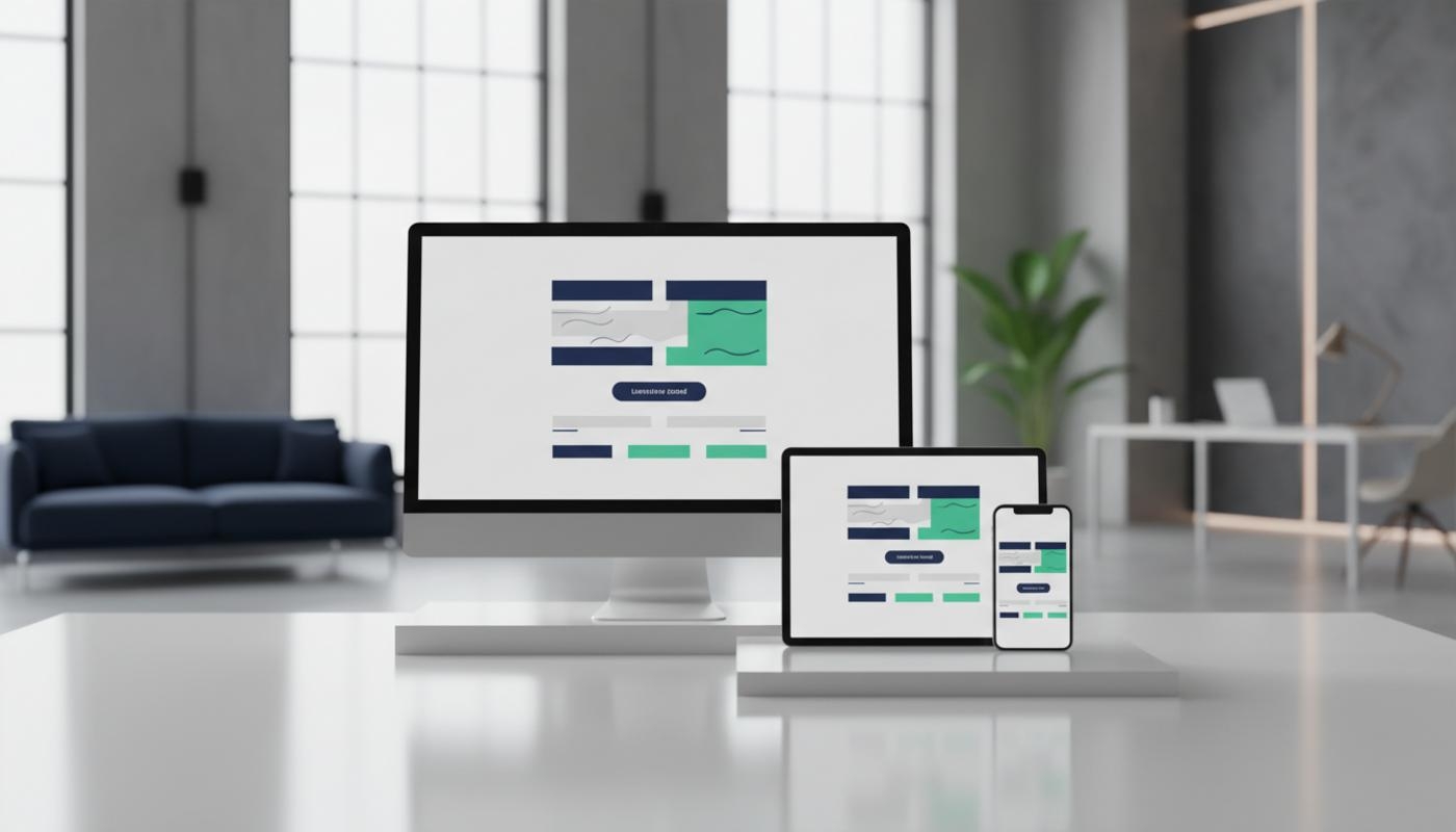
Better Landing Page Design UK
If you are paying for Google Ads, social media campaigns, email marketing, or SEO traffic but not seeing enough leads, you are not alone. Many UK businesses get people to click, then lose them once they reach the page. Better landing page design helps fix that by making each page faster, easier to trust, and simpler to act on.
A strong landing page gives visitors one clear reason to stay, one simple next step, and enough proof to feel confident before they click, call, buy, or enquire. When your adverts, emails, social posts, and search results send people to a focused page, you reduce confusion and give every visit a better chance of becoming a lead or sale. The aim is not to make the page more complicated, but to make the decision feel easier.
C2 Marketing helps businesses turn underperforming pages into practical growth assets through clear strategy, useful copy, smart design, and data led improvements. As a UK based digital marketing agency, C2 Marketing supports brands with SEO, PPC, social media, copywriting, web design, and web development. The focus is on simple, measurable improvements rather than unnecessary redesigns.
Why Landing Page Design Matters For Conversions
A landing page is often the first real decision point in a digital campaign. Someone may click from a paid advert, an organic search result, a LinkedIn post, or an email. The page then decides whether that interest turns into action, so it needs to confirm quickly that the visitor is in the right place.
This can be frustrating, especially when every click has a cost attached. You may have the right offer and the right audience, but still lose enquiries because the page feels unclear, slow, or difficult to use. The good news is that small changes can make a real difference when they remove doubt and make the next step obvious.
Many pages sit below their potential because they try to do too much. Several messages, mixed next steps, and cluttered layouts make visitors work harder than they should. A focused experience gives people a smoother route from interest to enquiry, which can improve results without increasing traffic spend.
For UK businesses, even a modest uplift can improve return on investment. Instead of simply spending more to bring in new visitors, you get more value from the traffic you already have. That is especially useful for SMEs working with careful budgets, local competition, and clear lead generation targets.
What A High Converting Page Needs
A high converting page has a clear purpose from the moment it loads. The headline should explain the offer in plain English, the supporting text should show why it matters, and the next step should feel obvious. The best pages do not make people hunt for the benefit or guess what happens after they click.
The top section of the page, often called above the fold, should include the main value proposition, a visible next step, and a reason to trust the business. This might be a short testimonial, a review score, a client logo, a guarantee, or a clear statement of experience. Visitors often make a quick judgement within seconds, so this section needs to answer one simple question: why should I choose you?
Good landing page UX design UK businesses can rely on is not about making a page look busy or flashy. It is about guiding attention in the right order, helping people understand the offer, and making the page easy to use on every device. If your page looks impressive but does not help users act, it is not doing its job properly.
One Goal And One Main CTA
The strongest pages usually follow a simple rule: one page, one job, one main CTA. If the goal is to generate quote requests, the page should focus on that action. It should not ask visitors to read unrelated pages, follow social profiles, download a brochure, and book a call all at once.
Too many choices can reduce action because people pause, compare, and delay. A focused page gives them one obvious path forward and makes the journey feel easier. You can still repeat the same CTA in useful places, such as the hero section, after key benefits, beside proof, and near the bottom of the page, as long as each button supports the same goal.
Clear Visual Hierarchy
Visual hierarchy means arranging content so visitors notice the most important information first. Headlines should stand out, benefit statements should be easy to scan, and buttons should be easy to spot without clashing with the brand. White space, contrast, font size, and section order all help users move through the page without feeling overwhelmed.
Images should support the message, not distract from it. For a UK service business, that might mean using real team photos, project visuals, location relevant imagery, or product shots that show the outcome clearly. Generic stock images can sometimes make a page feel less credible, while authentic visuals often build more trust because they show there is a real business behind the page.
Better Landing Page Design UK Best Practices
Better landing page design UK best practices focus on clarity, speed, trust, and relevance. UK users expect pages to load quickly, work well on mobile, explain value clearly, and handle personal data responsibly. They also tend to respond well to straightforward copy that avoids exaggeration and tells them exactly what they can expect.
Mobile experience should be a priority, not an afterthought. Many people browse, compare, and enquire from their phones, especially after clicking from social media or local search. Buttons need to be easy to tap, forms need to be simple to complete, and content needs to be readable without zooming.
Page speed can also affect results because slow pages create frustration before visitors have even seen the offer. Large images, unnecessary scripts, poor hosting, and heavy page builders can all make pages slower than they need to be. Helpful improvements include compressing images, reducing unused code, using efficient hosting, and checking key pages regularly. If speed is becoming a wider issue, C2 Marketing has shared practical advice on faster website performance.
Copywriting That Turns Interest Into Action
Landing page copy should be clear before it is clever. A visitor should understand who the page is for, what is being offered, and why it is worth acting on without reading every word. Strong copy uses benefits, outcomes, proof, and simple explanations to move people closer to a decision.
Message match is one of the most important copywriting principles for PPC landing page best practices UK campaigns. If someone clicks an advert about emergency boiler repair in Manchester, the headline should reflect that need rather than showing a generic plumbing message. Matching the page to the advert or search intent reassures the visitor that they have arrived in the right place.
Body copy should explain the value in practical terms. Instead of saying your service is innovative or industry leading, explain what the customer gets, how quickly they can expect help, what problem you solve, and what makes your approach different. Short sections, useful subheadings, and benefit led wording make the page easier to read.
For example, a local service business could replace a vague headline such as Professional Repairs with Same Day Boiler Repairs In Manchester. It could reduce a long form to name, phone number, postcode, and a short message. Adding a recent review beside the enquiry button could give visitors the reassurance they need to get in touch.
Calls To Action That Feel Natural
A CTA should be specific, visible, and easy to understand. Buttons such as Submit or Learn More are often weaker because they do not explain the result of clicking. More useful examples include Get My Free Quote, Book A Free Call, Request A Callback, or Download The Checklist.
Placement matters too because people are more likely to act when the button appears at the right decision point. A CTA near a strong testimonial, pricing explanation, or benefit section can work well because the visitor has just seen a reason to move forward. Repeating the same action across the page helps visitors act when they feel ready, so the aim is to guide rather than pressure.
Forms, Trust And GDPR Friendly Lead Capture
Forms are one of the biggest friction points on a page. Every extra field asks for more effort, and every unclear question can make visitors hesitate. For many lead generation landing page tips, the simplest advice is to ask only for what you genuinely need at the first stage.
Name, email, phone number, and a short message are often enough for an initial enquiry. If you need more detail, you can gather it later once the conversation has started. This feels easier for the visitor and can help more people complete the form.
Trust signals help people feel safer before they share details. These can include testimonials with real names or locations, review scores, recognised accreditations, secure payment notes, visible contact details, and case study results. UK visitors often want reassurance that a business is legitimate and easy to contact if something goes wrong.
Data capture also needs to be handled responsibly. For UK businesses, privacy notices, consent wording, cookie banners, and clear explanations of how personal data will be used all matter. The ICO provides official guidance on UK GDPR responsibilities, which is useful when reviewing forms and data handling.
Designing Pages For Different Traffic Sources
Not every visitor arrives with the same mindset. Someone clicking from Google Ads may be ready to compare providers now, while someone clicking from a social post may need more context before enquiring. A strong page should match the intent, source, and temperature of the traffic so the message feels relevant from the first few seconds.
For paid search, the page should closely match the keyword and advert promise. If your ad promotes same day quotes, the page should mention that near the top. Navigation should be limited so paid traffic does not drift away from the goal. If PPC is a major part of your strategy, C2 Marketing's PPC support can help align adverts, pages, tracking, and enquiry goals.
For organic search pages, content usually needs more depth because visitors may be researching before they contact you. These pages should answer key questions, include helpful proof, and make the next step easy to find. For email and social campaigns, consistency is vital because the message, image style, offer, and CTA should feel connected from the first click to the final action.
Using Data To Improve Results
Landing page optimisation works best when it is based on evidence rather than guesswork. Analytics can show where visitors come from, how long they stay, which buttons they click, and where they drop off. Heatmaps and session recordings can also reveal whether people are missing key content or struggling with forms.
A simple optimisation process starts with diagnosis. Look at conversion rate, bounce rate, scroll depth, device performance, form completion, and traffic quality. Then form a clear hypothesis, such as changing the headline to improve relevance or reducing form fields to increase submissions.
A/B testing landing page design does not need to be complicated. You might test two headlines, two CTA labels, a shorter form, a different hero image, or stronger testimonial placement. After each test, review the data and record what you learnt so future changes are based on real behaviour rather than personal preference.
Quick Wins For UK SMEs
If your page is underperforming, you do not always need a full redesign straight away. Start with the areas that most often create confusion or friction. Read the page as if you are a first time visitor and ask whether the offer is clear within five seconds.
Next, check your CTA and form. Make sure your main button is easy to see, action focused, and repeated in sensible places. Remove any form fields that are not essential for the first conversation, then move your strongest proof closer to the CTA where reassurance is most powerful.
Finally, review the mobile version and loading speed. A page that looks good on desktop can still lose enquiries on mobile if text is too small, buttons are cramped, or sections appear in the wrong order. If the wider website experience needs improvement, professional website design and development can help create faster, cleaner, and more conversion focused pages across your site.
Landing Page Conversion Checklist
- Does the headline explain the offer and benefit quickly?
- Is there one main goal for the page?
- Is the primary CTA visible above the fold?
- Does the page match the advert, email, or search intent?
- Is the page easy to use on mobile devices?
- Does the page load quickly enough to avoid frustration?
- Are testimonials, reviews, logos, or results placed near decision points?
- Is the form short, simple, and easy to complete?
- Does the page explain how personal data will be used?
- Are conversions, clicks, and form submissions being tracked?
Final Thoughts
Better landing page design is one of the most practical ways to improve results because it focuses on what happens after someone has already shown interest. A high performing page does not rely on tricks or aggressive sales tactics. It makes the offer easy to understand, removes friction, builds trust, and gives visitors a confident next step.
For UK businesses, the best results usually come from combining design, copy, tracking, and campaign strategy. Your page should match your audience, your traffic source, your offer, and your sales process. If you want a useful starting point, review your most important landing page today and look for the biggest source of hesitation.
If you would like help turning traffic into more enquiries, C2 Marketing can help you identify practical improvements and measure what works. The most valuable changes are often the ones that make the page clearer, faster, and easier to trust. With steady testing and the right structure, your landing pages can become a stronger part of your sales process.
Frequently Asked Questions
What Is A Good Landing Page Conversion Rate In The UK?
It depends on your sector, offer, and traffic source, but many pages aim for at least 2 to 5 per cent as a starting point. Pages with strong intent, relevant copy, fast loading times, and simple forms can often perform higher. The best benchmark is your own current performance, followed by steady improvement from there.
How Can I Increase Landing Page Conversion Rate Quickly?
Start by improving your headline, making your CTA clearer, shortening your form, adding social proof, and checking the mobile experience. These changes often reduce friction without needing a full rebuild. If you are running paid traffic, make sure the page matches the advert promise closely.
Should A Landing Page Have Website Navigation?
For paid campaigns, limited navigation often works better because it keeps attention on one goal. For SEO focused pages, some navigation can be useful because visitors may want to explore related information. The key is to make sure navigation does not distract from the main enquiry action.
Why Is Mobile Design So Important For Landing Pages?
Many visitors arrive from phones after clicking adverts, emails, social posts, or local search results. If the page is slow or hard to use on mobile, people are likely to leave before enquiring. Check tap targets, form fields, text size, section order, and page speed on a real phone, not just a desktop preview.
How Often Should I Test My Landing Page?
Review performance at least monthly and test changes when you have enough traffic to measure results. Focus first on high impact areas such as headlines, CTAs, forms, speed, and trust signals. Keep a simple record of each test so you can build on what you learn.